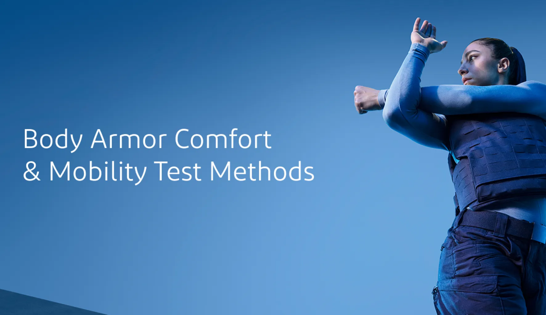
case study Dupont-Kevlar
Overview
- Client: DuPont™ Kevlar® (in partnership with OneMagnify)
- Role: Product / Web Designer
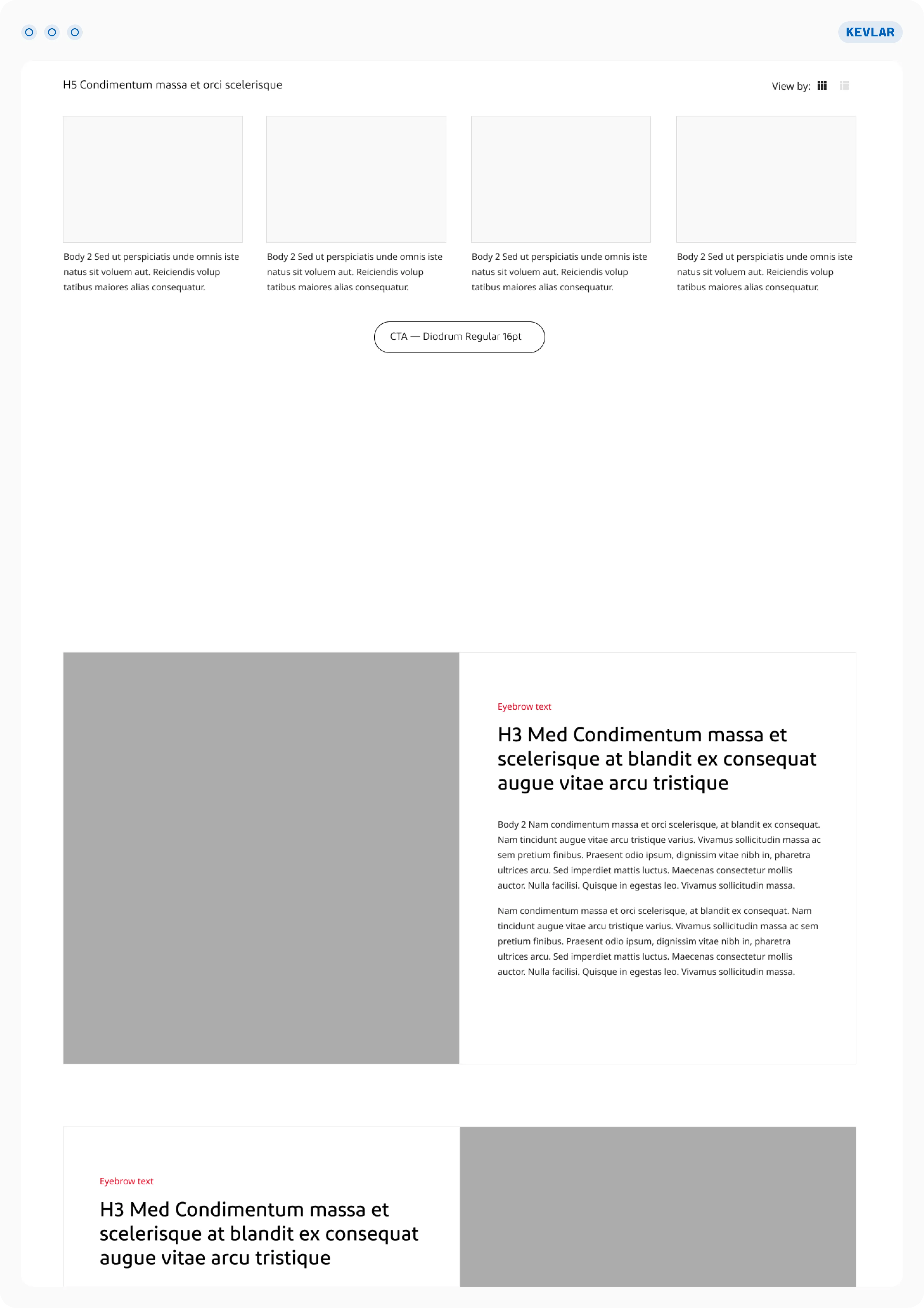
- Deliverables: Wireframes, High-Fidelity Figma Layout, Developer Copydeck & Component Guide
The Challenge
& Pain Points
The Client's Need
The Client: DuPont needed a dedicated page to launch their new Kevlar® Comfort & Mobility material for body armor. The challenge was to create a fresh, unique layout using only their existing, rigid design system.
The User: Security and tactical professionals suffer from heavy, restrictive gear. They needed an intuitive page that quickly explained how this new material solves discomfort and improves real-world mobility.
The Solution
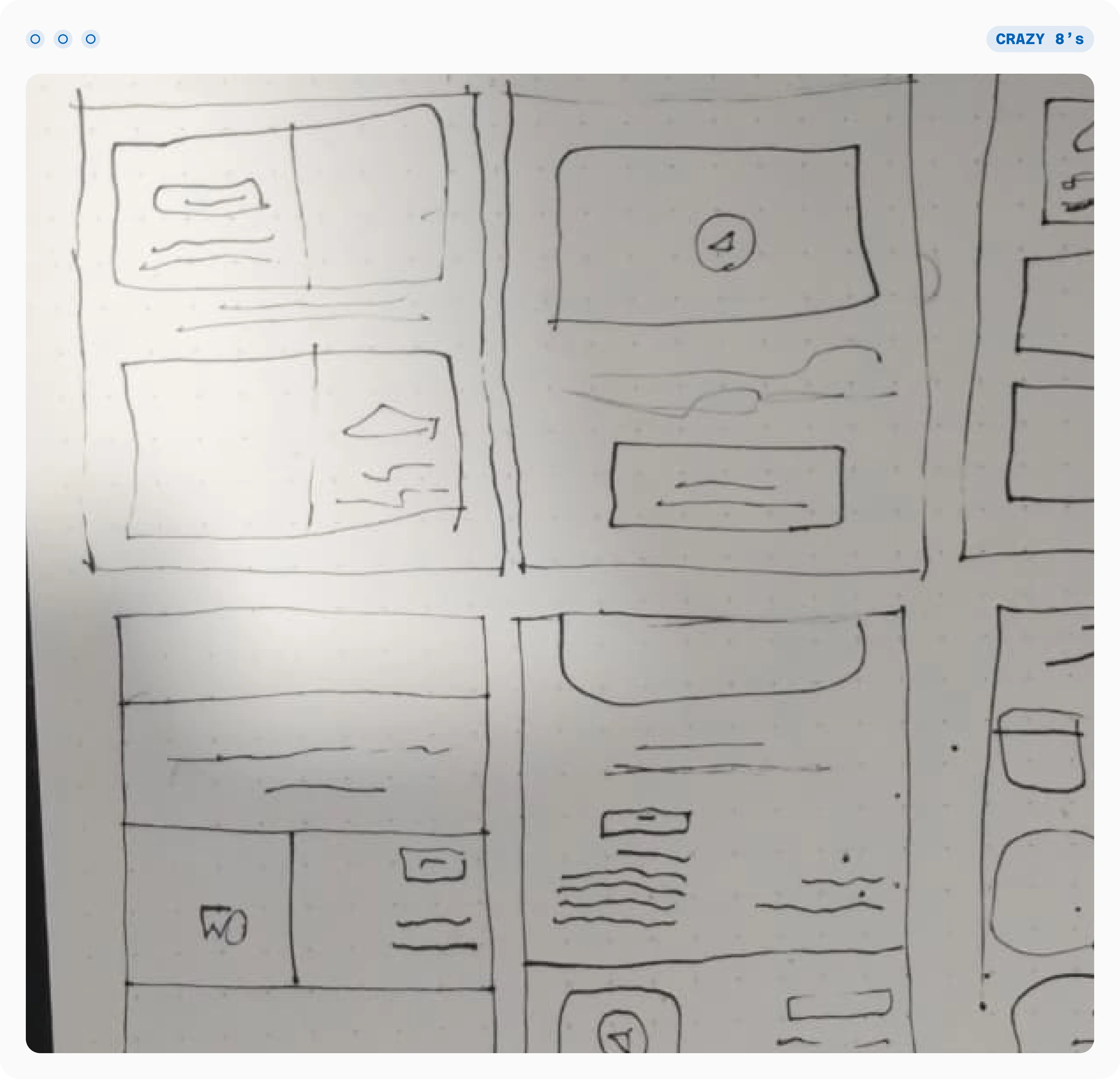
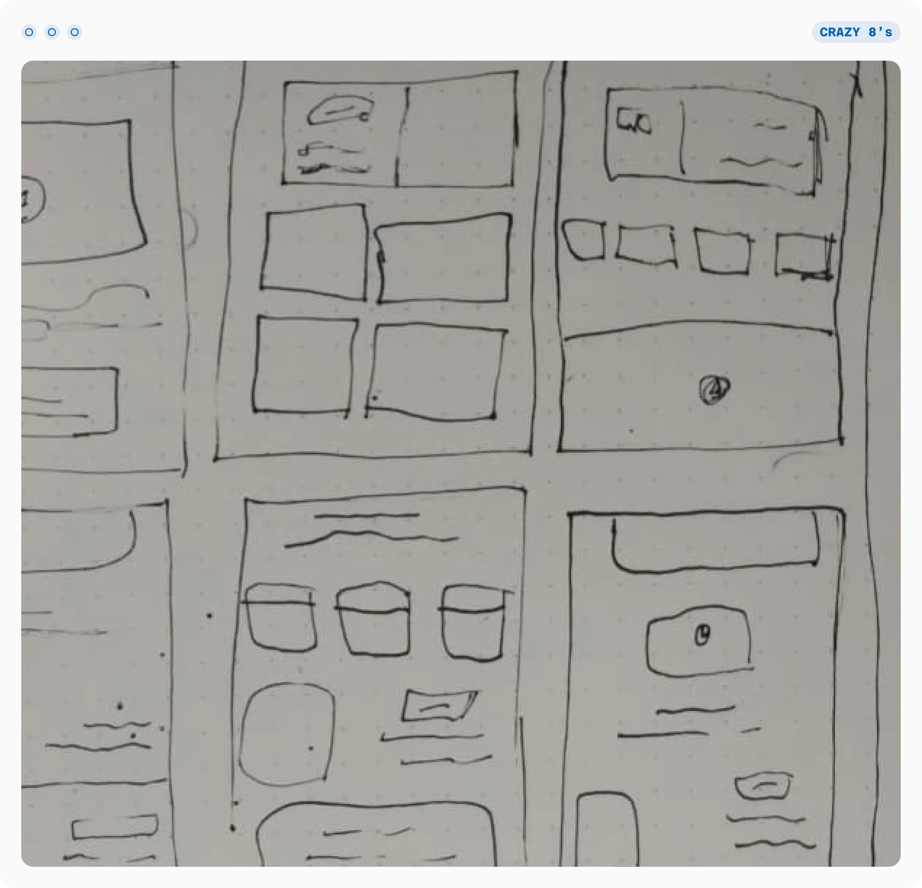
Strategic Layout: I reshaped the page hierarchy using DuPont's existing components to create a new narrative. Complex ergonomic data was broken down into quick visual callouts and high-impact imagery.
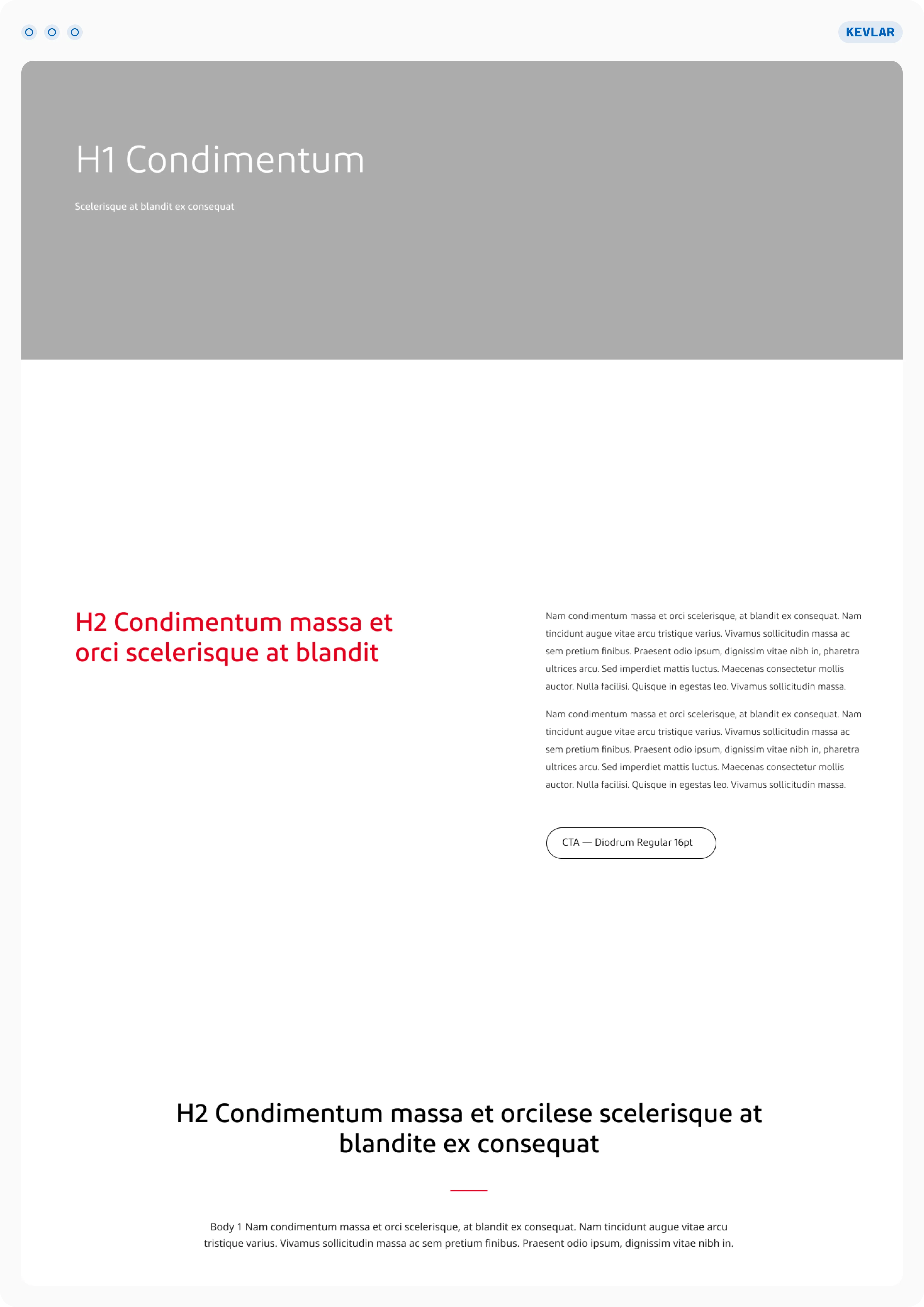
Developer-Friendly & Agile: I intentionally bypassed the mobile UI design. Since all design system components were already natively responsive, designing desktop-first ensured a seamless mobile adaptation while saving hours of design and development time.
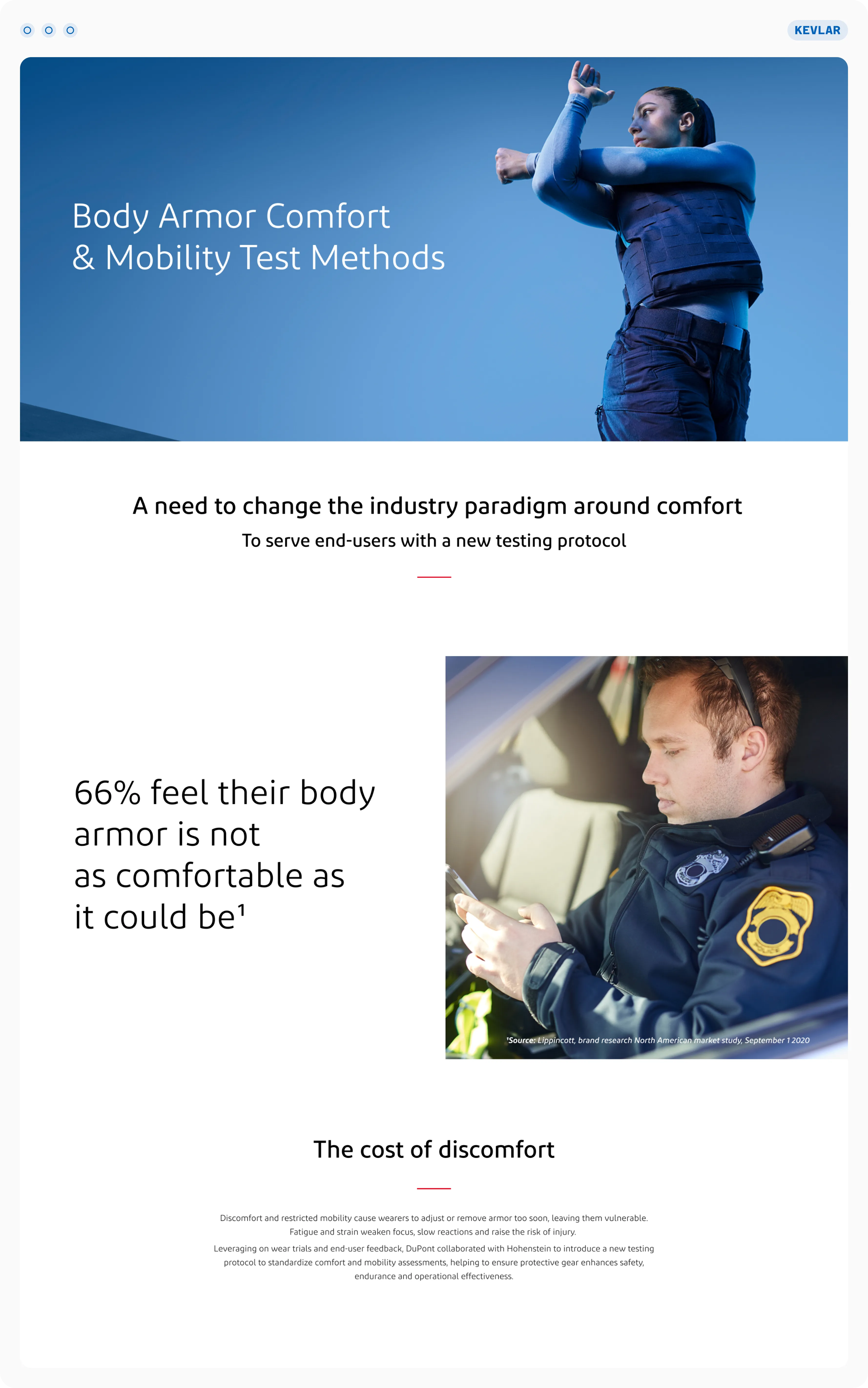
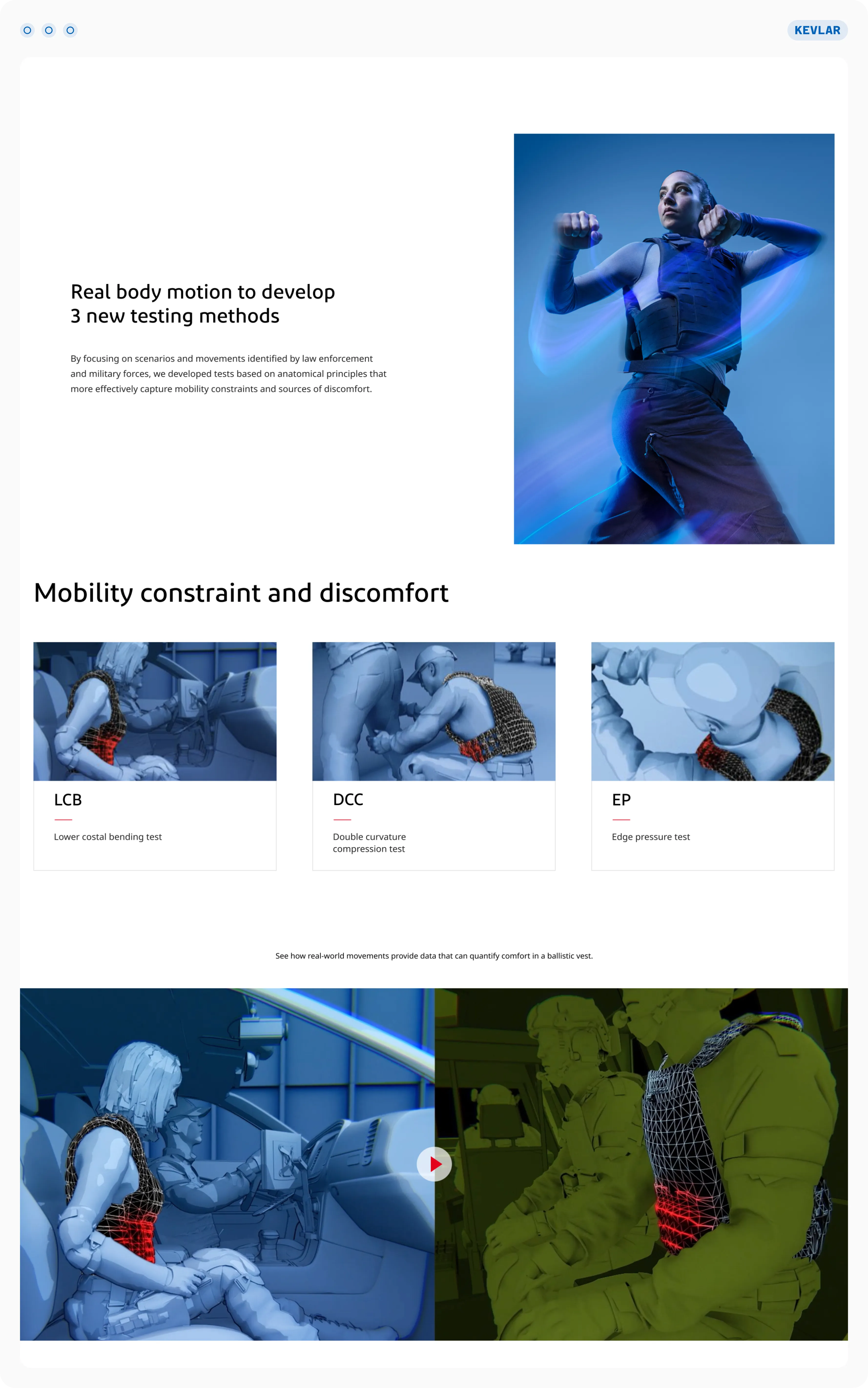
Working with a global safety leader was a great lesson in balancing a strict enterprise design system with the need for fresh, innovative product storytelling.
Deliverables
- Figma Layout: High-fidelity desktop UI using strictly organized design system components.
- Developer Copydeck: A technical handoff guide detailing section structures, component calls, and specs for every image, icon, and vector used.
Sofie App
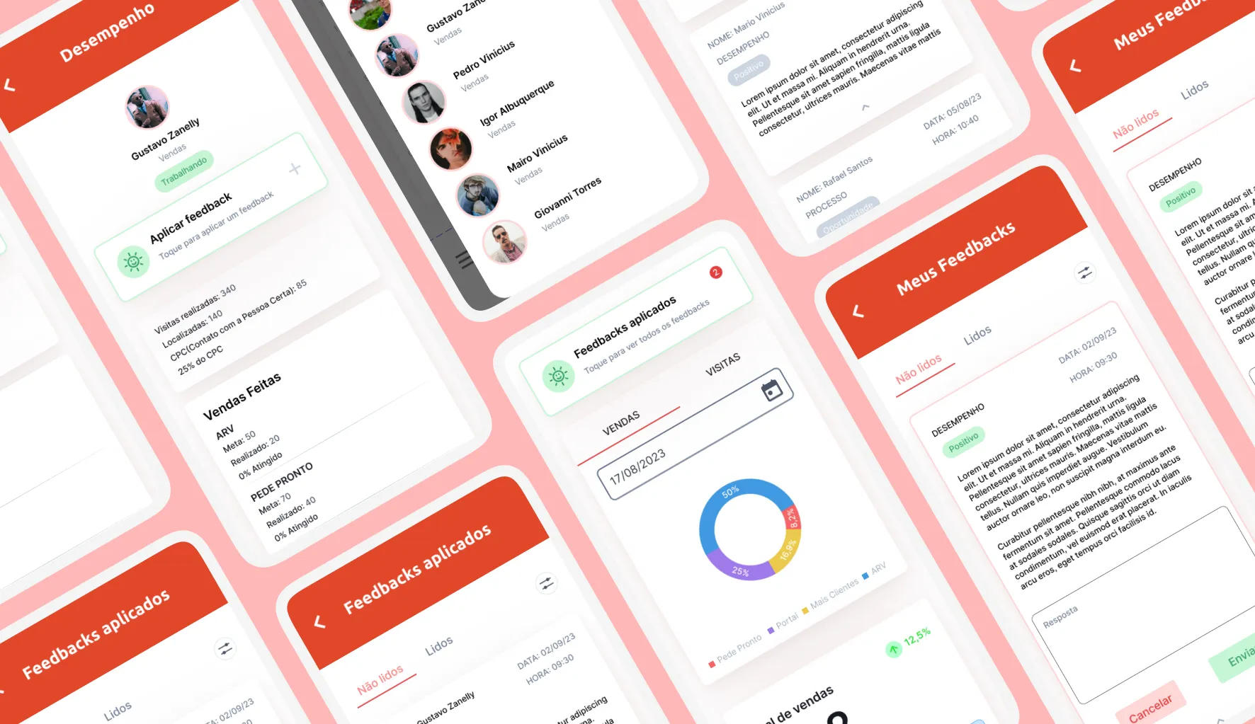
A mobile feedback flow that helps leaders manage remote teams.

G2 Base
An NDA product design engagement — enter the PIN to explore.